6 Retail Store Design Tweaks to Boost Sales
Merchandise sells itself in stores with appealing entryways, intuitive paths, upscale lighting and branded signage.
by: Joni Sweet
Every square foot of your store has the potential to make a sale. But that doesn’t mean you should cram in as many signs and products as possible. An attractive, intuitive design and plenty of open space is more important to your bottom line.
“Retail store designs are an extremely important part of today’s strategy for developing sales,” said Steve Goldberg, president of The Grayson Company, a consulting practice that works with brands and retailers.
While there’s no one-size-fits-all approach to creating the perfect retail space, there are some store design principles that will influence sales across the board. Here are tweaks every shopkeeper should consider.
Focus on the front
Getting customers into your store depends on having a well-designed entryway, said Goldberg.
“The most common mistake in store design is to underestimate the importance of the frontage of store. If you’re in a mall or on a street, the customer has a moment to decide if she’s going to come into your store.”
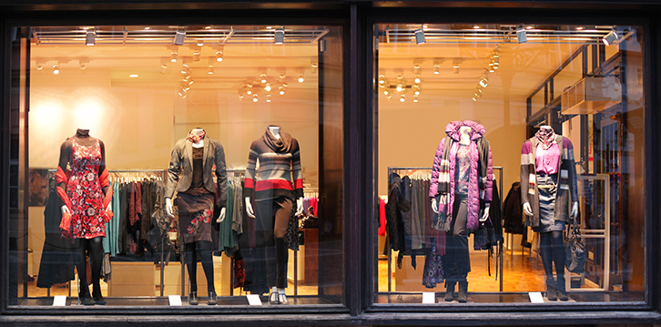
Don’t cover your front windows or displays with large, dense signage, he said. Instead, focus on simple, well-branded graphics and plenty of interior visibility from outside the store.
“Shoppers will come in because they need something or recognize the brand or the merchandise looks exciting. The frontage always has to have open, clear view toward the interior of the store.”
You may want to change your window displays frequently to keep customers interested.
Upgrade your lighting
In a brick-and-mortar store, good lighting is critical to entice customers, who are now inundated with well-lit, beautifully photographed products online.
“The lighting of a retail store has to be state-of-the-art. Having legacy lighting in today’s world just doesn’t give the crisp look and feel consumers expect today,” said Goldberg.
Lights that cast an attractive glow on products increase the likelihood of sales, he noted.
Play with color palettes
Color matters, especially when it’s part of your branding. Goldberg said brands that are easily recognized may want to accent a wall or product displays with key colors found in their logo. “You’ll see in new Verizon stores an echo of their red color. If you go to MetroPCS, you’ll see echoes of their lavender color.”
That said, specialty stores, high-end boutiques and smaller retailers have more success in using a neutral color palette in their stores, said Goldberg. “Higher-tier stores want to let the products and colors of the products tell a story. Those places tend to be much more neutral in color palettes.”
The most important goals are staying true to your brand’s essence and creating a space that feels like a breath of fresh air to customers. Avoid jarring shoppers with over-the-top color choices.
Create an intuitive journey
Make the customer’s path through the store feel intuitive. Generally, grouping products by categories improves the experience for customers and increases the chances they’ll find what they’re looking for.
“Presentations by category have to be clear and obvious. Conceptually, you’re telling stories and it has to be very clear in the visual outcomes. It’s important to make sure the categories and locations of things are clear,” said Goldberg.
Uses signage to help with navigation if you can do it in an appealing way that does not interrupt the retail path.
“If a store is planning to merchandise by category, then that needs to be embedded into a signage format that’s clear and crisp and changeable,” said Goldberg.
An effective store design also places the checkout counter at the natural end of the customer’s journey. Often, that’s at the back of the store, but sometimes it makes sense to place the cash registers toward the side.
Be sure to include displays of impulse purchases close to checkout. “Customers like something at the end of the journey and it’s a great opportunity to sell them something.”
Highlight new products
Have a plan for showcasing new products, whether it’s a fixture or a specific zone, said Goldberg. “You have to consciously think and plan for where you’re going to present things that are exciting and new.”
Since the front of your store has a big impact on customers, it may make sense to create a display near the entryway for this merchandise. Or dedicate a shelf or rack in other zones of the store.
Upgrade your graphics
Even if you want to upgrade your store design, remodeling might not be in your budget. If that’s the case, putting your dollars into stunning graphics will maximize your return on investment, said Goldberg.
“The simplest, most cost-effective way to convey a message is through graphics. It’s rather inexpensive to do and it can manifest itself in graphics or photography or signage. It’s a low-capital way to change up the presentation of the front of your store or any other elements within the store.”
Work with a graphic designer or retail consultant to develop a coordinated set of signs that express your brand’s identity. You don’t need to overwhelm the customer with a gallery; a few well-designed graphics in key places can go a long way.
To view the published article, click here.


